RETAIL STORE DESIGN, ACCORDING TO THE FIVE SENSES
Effective retail design lays the foundation for your business’ success. Interior décor, product placement, and physical layout can create an enjoyable customer experience and increase dwell time and sales. A great asset for a retailer is the ability to engage and heighten customer senses through cohesive store design. When working together, the five senses – sight, touch, hearing, smell, and taste—can reinforce your brand image and ultimately boost your sales. Investing in your store design will reap the rewards in customer loyalty and satisfaction.
Sight – Design
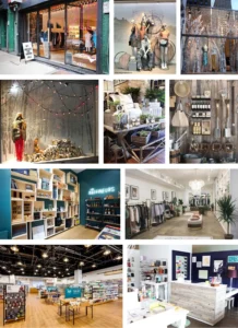
The outside of your store is the first interaction with a potential customer. It should be visually appealing and draw in prospects. Your window display should give a glimpse of your merchandise and be symmetrical and clean. The display can tell a story to develop a relationship with the customer before they set foot inside. You can create depth through product layering, but keep it clean and straightforward so the customer can easily focus. When designing your window display, maintain 2/3 white space and 1/3 product. Your storefront and signage should cater to your target market. Ensure signage is eye-catching and easy to read.
The first 5 to 15 feet of your entryway (threshold) are where customers transition into your store. Any products in this area may be overlooked, so keep it free of merchandise or promotions you want your customers to see.
Your display to the right of the threshold is known as the “Power Wall” and deserves extra attention. Nearly 90% of customers turn right after walking into a store. This “Power Wall” is where you can include high demand products or promotions, but make sure they are visually appealing.
Use furniture, displays, and racks to give your customers a path through your store and guide them from front to back. Most stores use a circular path to the right (counterclockwise) to get customers from the front of the store to the back, and then back again to the front. Placing eye-catching displays or items at the end of your aisles will draw your customers towards them. Make sure your aisles, floor, and displays allow customers to have more than enough personal space. Ease of access invites them to move freely down aisles and make purchases. Incorporate waiting areas with benches or seats to increase dwell time. Keep seats facing the merchandise so customers can still browse while taking a break.
Encourage impulse purchases by stocking small and affordable items that customers can easily grab near your check out area.
Sight – Color
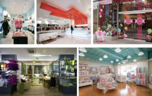
Choose a color scheme for your store that represents your brand image and appeals to your ideal costumers. There is a psychological basis behind each color, and your choice should ultimately reflect how you want your customers to react to your store.
For example, using a light or medium blue in your space has a calming effect and can relax your customers while they browse. Shades of green stimulate freshness, peace, and health, and are effective in florist shops, health food stores, and soft goods retailers. Reds, yellows, and oranges are energizing and can be used to draw attention to an item. These colors can speed up a shopper’s heart rate and stimulate their appetite, which is effective if you are selling food. They should be used sparingly in other retail spheres (ex: to draw attention to an item) because they can cause a customer to rush through your space. Purples and pinks are especially compelling in highlighting a product, as they are associated with aristocracy/ royalty. Using white as your retail backdrop implies simplicity and purity and allows you to experiment with other colors throughout your store.
Less is more when determining your color scheme. Try to choose colors that complement each other to avoid overwhelming your customers. Busy or intricate patterns can distract your customers and cause them to leave your store. Your color choice should ultimately come down to the type of response you wish to elicit from your customers when they enter your space.
Sight – Lighting
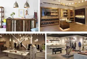
When deciding on general lighting, it is crucial to select a light source that uniformly illuminates every corner of your store. Ceiling lights or chandeliers should offer a general glow throughout your retail space. Accent lighting can highlight specific areas in your store using spotlights or track lighting. Accent lighting is especially powerful near displays and store windows. Decorative lighting, such as string lights, can be used as ornaments throughout your store. Position track lighting above or around your product to guide your customers toward it. Brighter lighting located in certain areas or focused on particular products can create the “Dazzle Effect” to entice your shoppers further. It is best if you use bulbs that emit the same color of light throughout your store. Burned out bulbs are distracting and should be changed immediately.
Touch
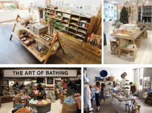
Customers instinctively want to touch your product. Creating an environment that gives easy access to your product encourages them to engage with your merchandise while also slowing them down. “Speed bumps” are breaks in your product displays that force customers to slow down and look, prohibiting them from quickly browsing through your store without purchasing. Speed bumps can be displays or designs towards the middle of your store or in the aisle. Keep “higher-demand” products displayed at eye level while placing lower-grossing products at the bottom or above eye-level.
Samples and product demonstrations allow customers to interact with your product before making a purchase. Inviting a customer to test your product through signage or employee guidance will elevate their senses and allow them to truly understand how the product will function in their own life. It also allows them to create a relationship with the product, making them more inclined to purchase.
Sound
Use sound to create an environment in your space. Ensure that the sound evokes certain emotions that you want your customers to feel while browsing your store. The music or sounds you play should reinforce the brand image created by store merchandising and design. The volume should be high enough that the shopper can hear the sounds, but not too loud as to distract. Other forms of sound, such as nature sounds, can add to the ambiance of your store in a manner that suits the brand.
Employee chat as a form of sound can be beneficial in elevating your customers’ comfortability. Greeting customers and engaging them in conversation will make them feel valued and welcomed in your space. Customer service is essential in building consumer relationships and should be utilized not only to generate sales but to construct a positive image of your store. Keep in mind that while employee conversation can be used as a tool, aggressive chatter and gossip between employees can deter customers from browsing your product and from coming back.
Smell
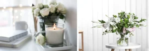
The sense of smell is incredibly powerful, as it easily triggers emotions and memories. You can incorporate smell through fresh flowers or scented candles. If the product you are selling has a distinctive smell (fresh leather, coffee), you may allow your product to do the work for you. When curating a scent throughout your store, pay attention to the intensity. An overpowering scent, even if lovely in small doses, will overwhelm your customers and have a deterring effect. Artificial scents from air fresheners or candles may overpower your store. Natural aromas from your product or carefully placed flowers have a softer scent that will lightly carry throughout the space. When using candles or scented sprays, be sure to place them in specific areas as opposed to throughout your entire space. Positioning these fragrances near an area where a customer will spend most of their time (consultation area, dressing room, check-out counter) is more effective in creating the association between that scent and your merchandise.
Taste
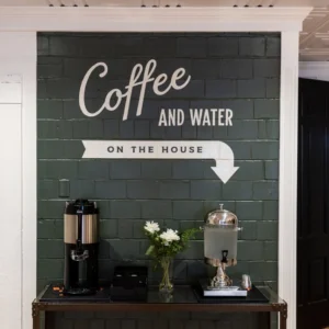
If you are selling food or drink in your retail space, allow customers to test your product by offering samples. For stores that do not sell food or drinks, you may also provide customers a complimentary beverage or finger food during store events, promotional sales, and regular shopping. Offering customers something to sample while browsing makes them feel like you are invested in their experience. This may encourage customers to stay longer, browse more, and come again.
The images depicted above are provided as examples of existing retailers and are not owned by ShopCore Properties. These images have been sourced from Google and Pinterest for illustrative purposes only. ShopCore Properties neither claims ownership nor asserts any rights over these images.
If you are the owner of any image displayed, please contact us immediately so we can provide the appropriate credit.
